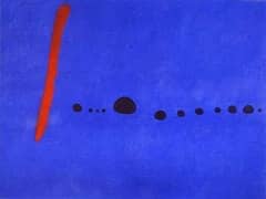
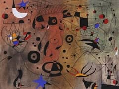
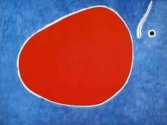
Triptych Bleu I, II, III, 1961 by Joan Miro
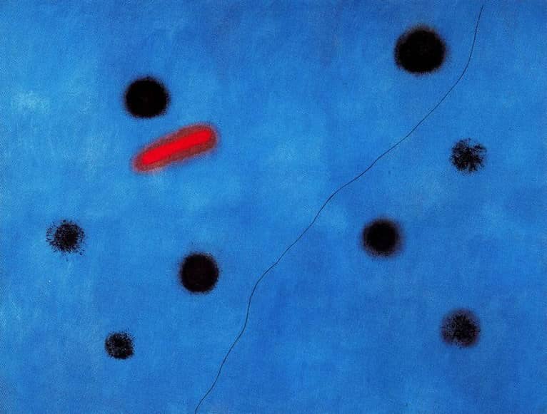
Miro's three large-format paintings Blue I - III are part of a series of triptychs which he painted at the beginning of the 1960s in his new studio in Mallorca.
In 1961, after three trips to the United States and exhibitions at the Galerie Maeght in Paris and Pierre Matisse Gallery in New York, Miro began further purifying the deepening of his earlier discoveries. This development had been heralded
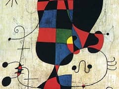
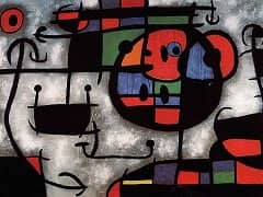
by Blue I, II, III. It reflects, above all, the supreme confidence the artist had attained in composing and coloring his paintings. The style is unmistakable. Miro was playing with codes that describe the movement of objects in a uniquely
simple way. For example, a certain trajectory might be represented by a line, generally a thin one, ending in a dot or in a pair of parentheses. This latter symbol was often used by Miro as a kind o container, to keep energy from escaping.
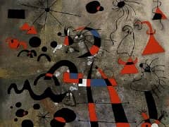
What is more, they look in two different directions, referring back to Miro's last pictures of the 1950s - full of sudden movements and primeval symbols - while at the same time looking forward to a completely new artistic freedom, a
spontaneous attitude towards the material and colors, in a hitherto unprecedented way.
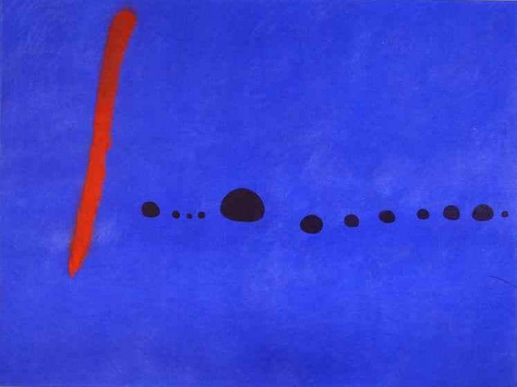
The three blue paintings have to be regarded as one. Seen separately, nothing much seems to be happening on them. Set against subdue surfaces in different shades of blue, Miro distributed a very small number of precise symbols - black dots with either sharp or blurred contours, thin lines drifting diagonally through the picture, and finally some sharp red contrasts, partly as blurred spots and partly as sturdy beams. These few symbols, however, are sufficient to make the blue space pulsate and vibrate, turning it into an unfathomable depth so that the viewer's glance wanders about and eventually becomes totally absorbed by the forcefulness of the blue surface.
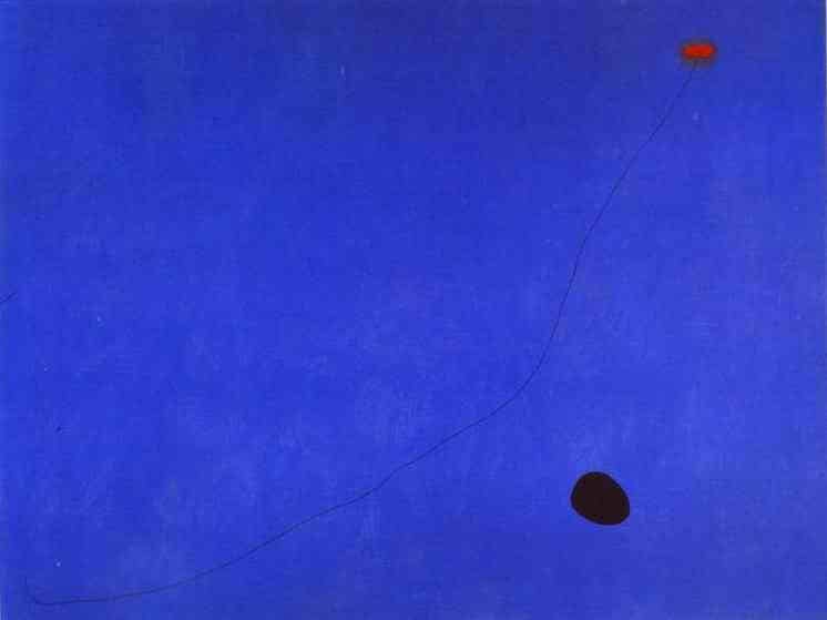
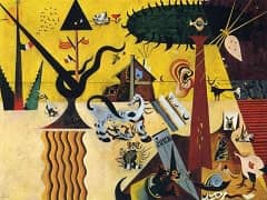
The quality of the Blue is unique. It is reminiscent of Miro's Dream Paintings of the 1920s, though those are even more complex and intricate. Should there ever be a history of the colour blue - as the poet Rilke once suggested after he had been inspired by landscapes of Paul Cezanne - then Miro's triptychs would undoubtedly form part of it. The large modulations of this colour have been applied with an amazing degree of sensitivity so that the pigment is no longer noticeable at all. This makes it a spiritual colour, in keeping with Romantic colour symbolism - a symbol of the inner and cosmic night, of artistic creation and of spiritual purity, a blue which is also the colour of dreams. It is one of Miro's masterly achievements that he enlivened this colour with only a small number of symbols and opened up the vast infinity of imagination.